Windows 8 Release Preview Review
I recently wrote about my thoughts on whether or not Windows 8 will catch on based on the customer preview that Microsoft released about 6 months ago. Sine then, Microsoft have had another 6 months to work on Windows 8 and also a lot of customer feedback. So let’s see if my opinion has changed. Remember, this is a ‘Release Preview’ so if the Windows 7 release preview is anything to go by, very little will change in the live release of Windows 8.
At the bottom of the article I have added a download button and the Windows 8 Preview product key so you can download and install this yourself. NOTE: I would strongly recommend that you setup Windows 8 in a virtual environment, rather than reinstalling what you have now. You can download VirtualBox, a free virtualisation tool so that you can create a Windows 8 virtual machine.
First Impressions
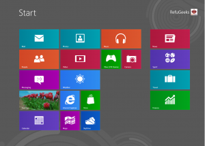
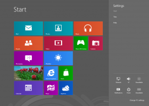
Well, my first impressions of this preview are very much the same as my first impressions last time, these are “what the hell is this!”. When you first load up Windows 8, you are greeted with the Metro ‘Start Menu’ that has replaced what we would all know as a traditional Windows environment.
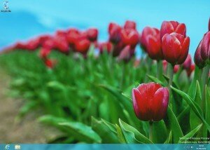
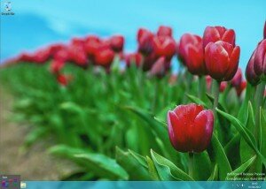
Clicking around the interface, its very easy to get lost. Even me, as a Windows ‘expert’ find it extremely difficult to navigate around. I was really hoping that Microsoft would have added a start menu button to the desktop for this release, but alas, the desktop is still missing this fundamental item that is engrained into all Windows users minds. Instead, what you have to do is jam you cursor right in to the bottom left hand corner of the screen (and I mean right into the corner) and a little ‘Start’ image appears. Only then can you get back into the start menu. Of course, you can also use the Windows key on the keyboard, but a lot of ‘normal’ users tend to use the mouse rather than keyboard strokes.
Usability
As I touched on above, the whole experience of Windows 8 just feels like too much effort. Everything is hidden away in little nooks and crannies which make things exponentially more difficult for the user to navigate around. For example, working out how to shut Windows 8 down took me around 10 minutes. You have to first of all jam your mouse into the top right hand corner of the screen, a menu will then popup, select ‘Settings’ and you will then see an option for ‘Power’ (amongst other things). From here you can shut the machine down or restart it…It’s much more convoluted than the old Start > Shutdown. Very simple indeed.
Microsoft are focussing on the touch screen market with Windows 8. I think this is another bad move on Microsoft’s part, first of all, the vast majority of desktop and laptop computers aren’t touch screen. Second, even if they where, can you imagine how much your back would hurt after leaning forward to touch a PC screen for 8 hours a day (12 hours in my case) – it’s an ergonomic disaster waiting to happen.
What about Bling?
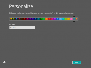
That wasn’t a typo, I did mean to type ‘Bling’ and not ‘Bing’…by ‘Bling’ I mean the look of Windows 8. When you first setup Windows 8, you are asked to set a colour scheme, this is then carried out throughout the whole system. I have to admit that it does look good, if it was for personal use only. However, for the corporate market, I think it’s looks too childish and informal.
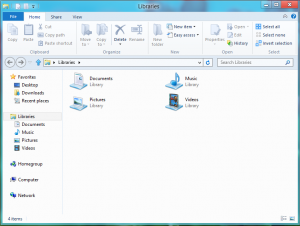
The desktop has some really nice transparency features enabled by default, even on my Virtual Machine that doesn’t have 3D graphics enabled. The colours are all very modern looking pastel colours, that, for the most part are very easy on the eye. Windows Explorer has also been re-design to fit in with the Office 2007/2010 ribbon interface.
More Confusing Stuff…
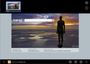
Some of the other parts of Windows 8 that confused me are Internet Explorer and actually using the Metro ‘Start Menu’. First of all, Internet Explorer (IE for short) has two different interfaces, one when you open IE through Metro and another when you open IE through the desktop. The former being a strange, full screen affair were you have to right click on the screen to get the menu’s up (I wonder how a user would right click on a touch screen?) and the latter being the ‘normal’ interface that you would expect from IE 9.
The Metro ‘Start Menu’ only has a handful of applications and shortcuts on there by default. So I wanted to add other things that are useful to me, like the Snipping Tool and Explorer. Again, this took me a few minutes to work out. To do this, you have to right click on the Metro ‘Start Menu’, then a ribbon appears at the bottom of the screen which has a button for ‘All Apps’. Click on this and you can open other apps and pin them to the Metro ‘Start Menu’. Once again configuration and usability is centred around the right mouse click – my question still stands…how the hell are you supposed to right click on a touch screen?
Conclusion
I’ll keep this short. Loads of room for improvement, hard to navigate and very confusing to use. Come on Microsoft, you are capable of much better than this…look at Windows 7. I will most definitely be sticking with Ubuntu.
What are your thoughts on Windows 8? Why not tell us in the comments section.
DownloadProduct Key for installation:
TK8TP-9JN6P-7X7WW-RFFTV-B7QPF


Pingback: PinguyOS 12.04 Review | RefuGeeks()
Pingback: How Will the Microsoft Surface Tablet Shape Up (and will it be better than the iPad)? | RefuGeeks()
Pingback: A Week With Windows 8 | RefuGeeks()